How Responsive Web Design Boosts User Engagement and SEO
Kevin Sambu
May 5, 2025
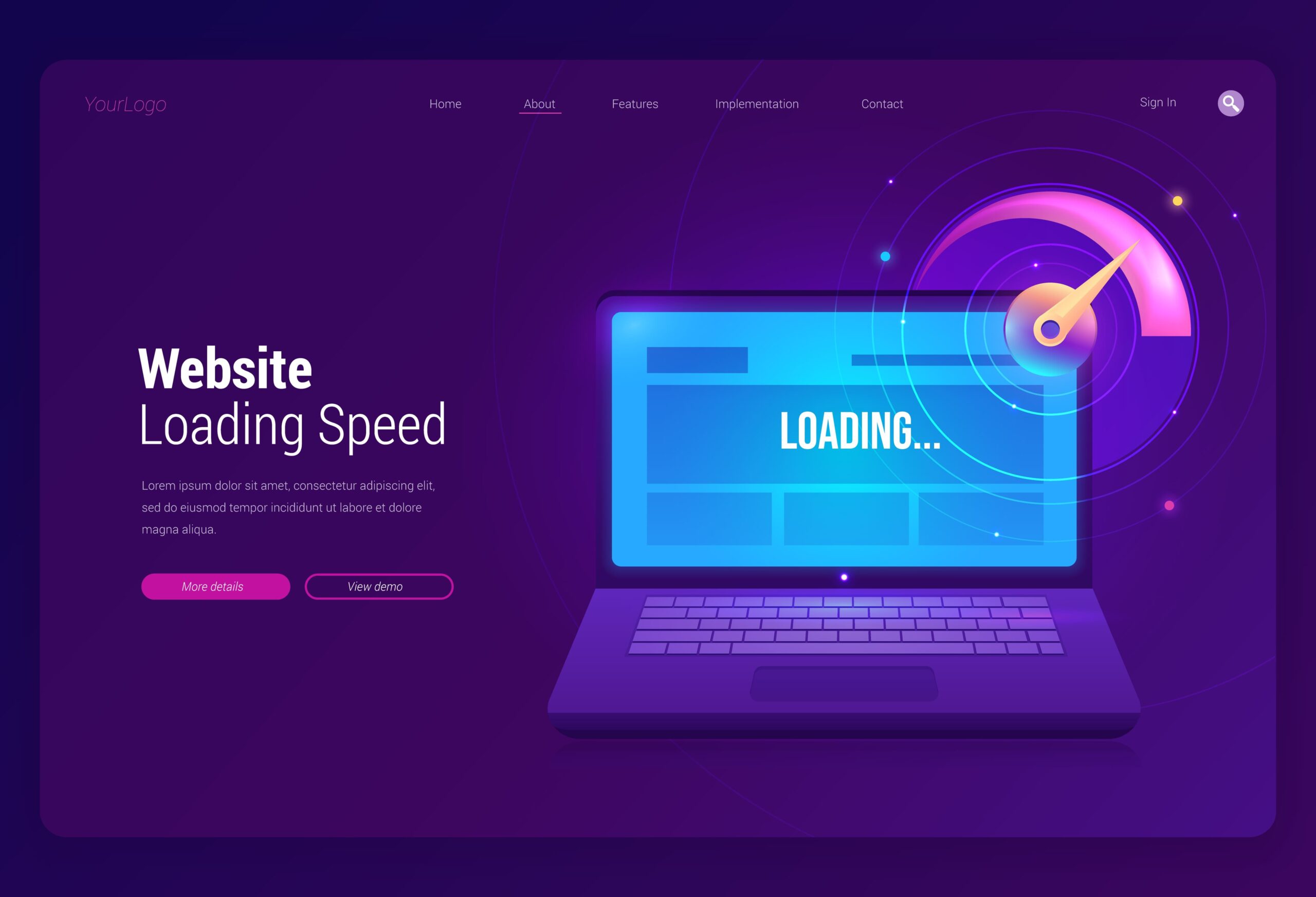
Responsive design is no longer optional—it’s essential for user experience and search engine performance. At Netspark Web Development, we build websites that look great and perform flawlessly on every device.
Benefits of responsive design:
Optimized for smartphones, tablets, and desktops A responsive website adapts to various screen sizes, ensuring your site is accessible and visually appealing on any device. This leads to a more engaged audience and increased user satisfaction.
Improved search engine rankings (Google prioritizes mobile-first sites) Google’s mobile-first indexing means that responsive design is crucial for ranking higher in search results. With mobile optimization, your site is more likely to appear at the top of search engine results, driving organic traffic.
Better user retention and lower bounce rates When users access your site on any device, they expect a smooth and functional experience. Responsive design prevents frustration, encouraging visitors to stay longer and return to your site in the future.
Increased conversions and engagement Responsive design boosts engagement by providing a user-friendly experience that adapts to each visitor’s needs. This leads to higher conversion rates as visitors can navigate your site more easily and complete desired actions.
Consistent branding across devices A responsive site ensures that your branding is consistent across all devices. Whether users visit your site on mobile or desktop, they will experience the same seamless design, reinforcing your brand identity.
Responsive design ensures your website meets modern expectations for usability, speed, and accessibility, which directly impacts user satisfaction and search engine performance.

